Overview:
Ataraxia, was concept that I came up with. I wanted my brand to imitate the Styles of Hermes and Godard, which offer exclusive and timeless luxury exotic leather accessories and handbags. My brand Ataraxia’s concept is dedicated to rarity, quality, and customization. Throughout the course, the brand evolved in terms of aesthetics, but the core idea remained consistent: creating one-of-a-kind pieces for a discerning clientele who values artistry, exclusivity, and heritage.
Process:
Initial Concept Development:
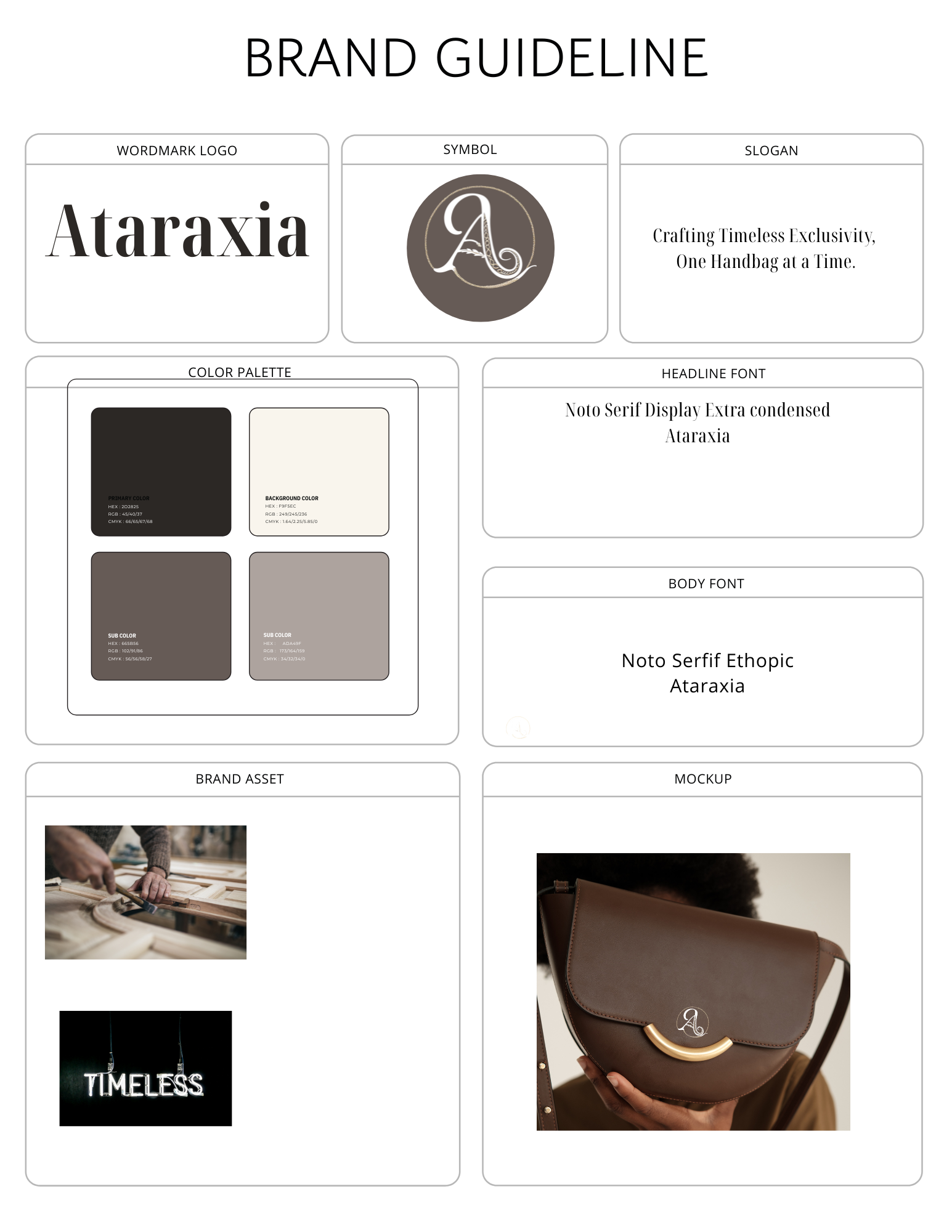
From the very beginning, the concept of Ataraxia focused on creating luxury handbags that are not only beautiful but also serve as investments. The main challenge was defining the exclusivity and high craftsmanship that would distinguish Ataraxia from other luxury brands. My concept stayed true to the idea of offering one-of-a-kind, customizable handbags. I used tools like Adobe Illustrator and Canva for logo creation and visual assets.
Typography, Symbol, and Logo Creation:
For the typography, I chose a serif font, which gave the brand a classy, sophisticated look. I used Adobe Illustrator to craft the logo, which was a challenging but rewarding process. The logo features the letter “A” wrapped in a snake like texture, representing timelessness and the exotic leathers used. The snake is symbolic of the uniqueness and rarity of the materials, aligning with the brand’s values.


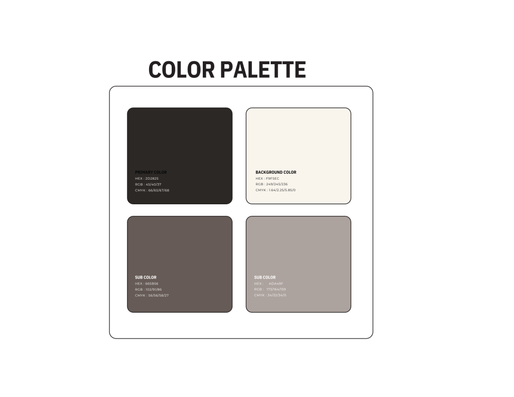
Color Palette and Business Card:
The color palette consists of neutral, timeless shades of beige, grey, brown, and black, reinforcing the luxurious feel of Ataraxia. For the business card, I used Canva, ensuring it was simple, elegant, and functional. The card includes all the necessary contact information and uses colors from the brand palette for consistency.


Brand Assets, Mockups, and Applications:
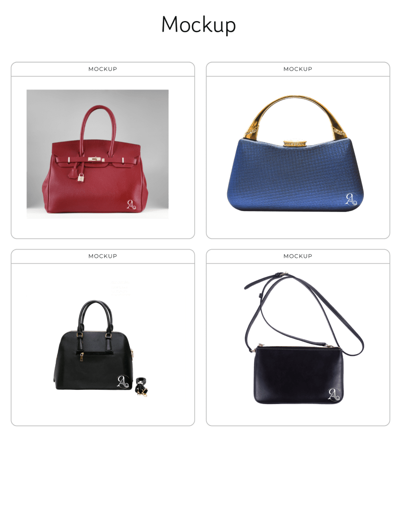
Creating mockups was one of the more challenging aspects of this project. Initially, I had difficulties with the process, but after making adjustments, I was able to showcase Ataraxia’s logo subtly on handbag mockups. I also incorporated design theories like symmetry, space, and texture in poster mockups and visuals, which helped enhance the brand’s aesthetic.
4. Critique & Reflection:
The strength of my brands identity lied in its consistent emphasis on luxury, rarity, and craftsmanship. The most challenging aspect was creating the logo in Adobe Illustrator, but once completed, it became a defining element of the my brand. Feedback helped refine my approach to mockups and fine-tune the visual balance of the brand’s identity throughout the class assignments.
5. Final Thoughts:
This semester, I learned the intricacies of brand creation, from concept development to the visual design of brand assets. I plan to use these skills throughout my degree. It was really nice being able to learn and apply the skills we learned at the sam time.

Leave a comment