Overview
Creating the wordmark logo for Ataraxia was a smoother process than I anticipated. I quickly found fonts that aligned with my brand’s vision—something timeless, simple, and easily recognizable. The process was both exciting and insightful, allowing me to refine my brand’s identity visually.
Process
Techniques and Tools
To design the wordmark logo, I used Canva, a versatile design tool that provided access to a wide range of fonts and customization options. The key elements in my design were:
- Font Selection: Kiona for the brand name and Garnet for the slogan.
- Spacing and Alignment: Ensuring the typography was clean and balanced.
- Color Consideration: Keeping it simple to maintain a refined and luxurious feel.
Design Process
- Choosing the Fonts: I selected Kiona for its modern, sleek appearance and Garnet for the slogan to add a touch of elegance.
- Experimenting with Layouts: I tested different font sizes, spacing, and placements to achieve the perfect balance.
- Refining the Details: Adjusted alignment to ensure readability and aesthetic harmony.
- Finalizing the Design: After multiple iterations, I settled on a minimalist yet striking wordmark that embodies Ataraxia’s core values.
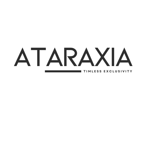
Final Wordmark Logo
The final wordmark logo effectively captures Ataraxia’s essence of timeless exclusivity. The clean, contemporary look ensures that it is easily recognizable while maintaining a luxurious feel. The contrast between Kiona and Garnet creates a refined yet approachable aesthetic, reinforcing the brand’s identity.
Critique
Strengths
- Readability: The font choice ensures clarity, making the brand name and slogan easy to recognize.
- Timelessness: The minimalistic design contributes to a classic, enduring appeal.
- Alignment with Brand Identity: The logo embodies sophistication and exclusivity, perfectly mirroring Ataraxia’s mission.
Areas for Improvement
- Uniqueness: While the font choices are strong, exploring slight customizations could further enhance brand differentiation.
- Scalability: Testing the logo in different sizes and formats may help refine its adaptability across various platforms.
- Typography Refinement: Minor adjustments to spacing or weight could enhance the overall impact.
Feedback
To further refine the logo, I am requesting feedback from a classmate. Some specific questions I would like input on include:
- Does the wordmark effectively communicate Ataraxia’s brand identity?
- Are there any aspects of the design that could be improved for better readability or uniqueness?
- Does the combination of Kiona and Garnet work well together, or should I consider alternative pairings?
Designing Ataraxia’s wordmark logo was an insightful experience that reinforced the importance of typography and branding consistency. With constructive feedback, I look forward to refining it further to ensure it fully embodies the essence of timeless exclusivity.

Leave a comment